Q-Bi, from a Super User Perspective! Part 1
By Matt Heffelfinger, MBA, RN, CFRN, EMT-P, CMTE *
The Q-Bi Tool was developed by Quick Med Claims (QMC), in concert with QMC Clients, several years ago to provide additional transparency, more robust reporting, and business analytics capability. The tool was initially deployed in 2021 and is enhanced through an agile development process (monthly improvements) based on feedback from the user community. I was an early user of Q-Bi and have provided feedback to QMC over time. As the system has evolved, so has my use of the tool. Here are some of the highlights of how one super user takes advantage of the tool.
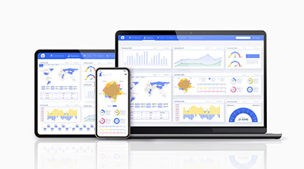
The Q-Bi Tool is an amazing feature provided by QMC. Q-Bi incorporates easy-to-read dashboards with the ability to click on an individual item to drill down to more detailed information. Q-Bi also has a Document Management section that allows for the secure transmission of documents and reports between the customer and QMC, and a Trip Search feature that includes multiple options.
I have found that I utilize the Q-Bi Tool in five main ways; conducting a quick 10-minute daily review, capturing information to prepare for Board presentations, completing a periodic review of specific information, accessing the Document Management portal, and utilizing the Trip Search.
Conducting a Daily 10-minute review
I usually access Q-Bi daily. In less than 10 minutes I can quickly review the different dashboards. This gives me a quick overview of changes on a daily basis. Below are my morning go to’s…
- The “Daily Snapshot” is a recently added feature. Provides quick glance at certain KPIs, cash performance, and trip volume.
- My favorite dashboard within Q-Bi would have to be the “Revenue at a Glance” feature. With this tool I can quickly change the Fiscal Year Start Month and Month End to assess our RCM data on a monthly, quarterly, or yearly basis. This tool allows me to see changes in estimated net revenue per trip and annual revenue as well as actual closed trip revenue. It also lets me see the overall payor mix for the selected timeframe. Finally, I can review the “Payor Category Detail” to see how many claims remain open for the selected timeframe and the estimated revenue yet to be collected.
- Under the “Cash” dashboard, there are two options: Monthly Deposit Trend and Cash Performance at a Glance. Monthly Deposit Trend shows a 15-month history of monthly cash deposits. The “Analyze It” feature produces a trend line to show if deposits are trending up or down. The Cash Performance at a Glance shows a breakdown of how quick payments are received and is one of the charts our Board is very interested in.
These three dashboards are very easy to navigate on a daily basis and provide real-time information in the time it takes to drink a cup of coffee (or a Diet Coke for me).
Preparing for a Board Presentation
There are many places that allow for the data to be exported into an image or PDF. These can then be added to a presentation to your Board of Directors or other stakeholders. Examples of the information I use include:
-
Trip Volume
There are two charts I use for this: the “Trip volume by date” and the “Trip volume by date and primary payor”.
This provides a depiction of monthly transport volume as well as a breakdown between primary payors. These can be useful in helping explain variations in monthly deposits if a disproportionate volume of trips were Medicare/Medicaid/Self-pay.
-
Deposits
Here again, I use two charts: the “Payment by Deposit Date” and the “Payments by Date and Primary Payor”.
-
Net Revenue per Transport (NRPT)
This chart provides a three-year review of monthly NRPT and may be helpful in identifying seasonal trends. This is an example of clicking on an item in a KPI that expands into a chart.
-
Collection Timeliness
As I mentioned above, our Board is very interested in this chart. Since we are a consortium hospital-affiliated program, the finance representatives on our Board were not familiar with the ambulance billing process and prolonged payment intervals for some commercial and auto payors. This chart not only helped me educate our Board, but it allows me to monitor any changes or delays in the timeliness of payments.
-
Cash KPI
This is the final chart I review with our Board. It provides an overview of the average monthly cash payments, gross charges, and net charges for the last 15 months. It also provides a summary of the collection timeline.
It takes me about 30-45 minutes to acquire and enter these charts into our quarterly Board presentation. When we first began using these charts for the Board presentation, there was a lengthy discussion to familiarize them with the information. Now that we have been using this format for almost two years, we cover them in about 10 minutes.
These two specific applications allow me to monitor the health of the revenue cycle management (RCM) process and report to my Board in a manner that provides them with insight as well. Please keep your eye out for the next installment where I provide some additional uses.
More to come next month, stay tuned for part 2!
*Matt Heffelfinger is the Program Director for West Michigan Air Care (WMAC) in Kalamazoo, MI. He has over 35 years of experience in the EMS industry including over 20 years in air medical transport.