Q-Bi, from a Super User Perspective! Part 2
By Matt Heffelfinger, MBA, RN, CFRN, EMT-P, CMTE *
The Q-Bi Tool was developed by Quick Med Claims (QMC), in concert with QMC Clients, several years ago to provide additional transparency, more robust reporting, and business analytics capability. The tool was initially deployed in 2021 and is enhanced through an agile development process (monthly improvements) based on feedback from the user community. I was an early user of Q-Bi and have provided feedback to QMC over time. As the system has evolved, so has my use of the tool. Here are some of the highlights of how one super user takes advantage of the tool.
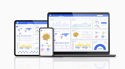
The Q-Bi Tool is an amazing feature provided by QMC. Q-Bi incorporates easy-to-read dashboards with the ability to click on an individual item to drill down to more detailed information. Q-Bi also has a Document Management section that allows for the secure transmission of documents and reports between the customer and QMC, and a Trip Search feature that includes multiple options.
I have found that I utilize the Q-Bi Tool in five main ways; conducting a quick 10-minute daily review, capturing information to prepare for Board presentations, completing a periodic review of specific information, accessing the Document Management portal, and utilizing the Trip Search.
Periodic Review of Specific Information
Completing a periodic review of specific information is where I use the tool the most. As I mentioned in the first installment, the “Revenue Performance at a Glance” dashboard contains an enormous amount of information. All the individual data points can be expanded to find more detailed information. Once you have identified the specific area of data you want to review, you can change the Fiscal Year start month and end month. This immediately allows you to see changes in monthly, quarterly, or yearly trends. One example includes changing the parameters in the three “YTD ***” graphs in the middle of the dashboard.
A simple right-click on the commercial bar of the “YTD Payor Mix Trip volume” opens a menu that allows you to select “Payor Name”. This will show the different commercial payors for the time you have chosen. You can further expand this chart into full screen to show all the payors and the number of transports per each. This was very useful in preparation for the NSA to identify any potential out-of-network commercial payors that may be a good candidates for network negotiations. Once you had this chart, you could select a similar time frame in previous years to see if trends appeared.
Another dashboard that provides a wealth of information is the “Financials”. This is a collection of multiple financial reports broken down into various topics. For those programs that have a ground EMS component, there is a newer report that includes some of the cost-collection data needed to comply with the federally mandated ground reporting guidelines.
I have covered just a fraction of the possible uses of the various dashboards and charts. Once you have identified a specific area of information you want to analyze, just click on the corresponding data point, graph, or report, select the timeframe you want to use and drill down to the level of data you want. A great feature that I guarantee you will use at some point is the “Restore Dashboard”. If you get to a point where you aren’t sure how you got there or can’t get out of it, this feature is available to reset back to the main dashboard.
Accessing the Document Management Portal
The Document Management portal is a secure area for the customer and QMC to share information back and forth. A few examples include:
- QMC announcements
- These may be things like the monthly QMC flyer or updates on legislative developments.
- Reports
- This is where things like monthly reports or dashboards are shared.
- Documents
- This may be where the customer sends documents to QMC or QMC sends documents to the customers. An example may be a patient charity application that QMC received and wants the customer to review.
- This area allows for folders to be added by either QMC or the customer, so it is very customizable to meet your specific needs.
Utilizing the Trip Search
The Trip Search feature was added about a year ago. There are several different ways to search within this feature.
- If you know the patient’s name or DOB, you can search for them specifically.
- You can also search by service dates, either a specific date, a predefined range, or a custom range.
- You can also search for the destination facility. This is beneficial if you transport to various facilities and want to review just those transports.
Once you have the trips you are looking for, you can select the “Charges” or “Credits” tabs to see any activity that has occurred for that trip.
I hope this review of QMC’s Q-Bi has been helpful. I have only scratched the surface of many of the capabilities and features within the Tool. It allows you to have minimal interaction by just clicking on the main dashboards if you don’t have the time or desire to perform more detailed searches, while still obtaining vital information about your program. It also allows the more adventurous user the ability to dig deeper and access your information when they want to.
QMC has been very receptive to customer input and feedback regarding the different dashboards and reports and continually assesses new ways to provide information to their customers. If you haven’t explored Q-Bi for your organization, I highly recommend you contact Ed Marasco or Gary Harvat for further information.
*Matt Heffelfinger is the Program Director for West Michigan Air Care (WMAC) in Kalamazoo, MI. He has over 35 years of experience in the EMS industry including over 20 years in air medical transport.